Branding & Identiteit
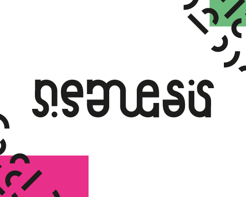
Nemesis
Krachtige en gedurfde merkidentiteit voor een innovatief tech bedrijf.
Over het project
Nemesis is een tech startup die disruptieve oplossingen biedt. De merkidentiteit moest deze ambitie en durf weerspiegelen.
Merkpositionering
De naam Nemesis verwijst naar kracht en vastberadenheid. De visuele identiteit speelt in op deze thema’s met gedurfde vormen en contrastrijke kleuren.
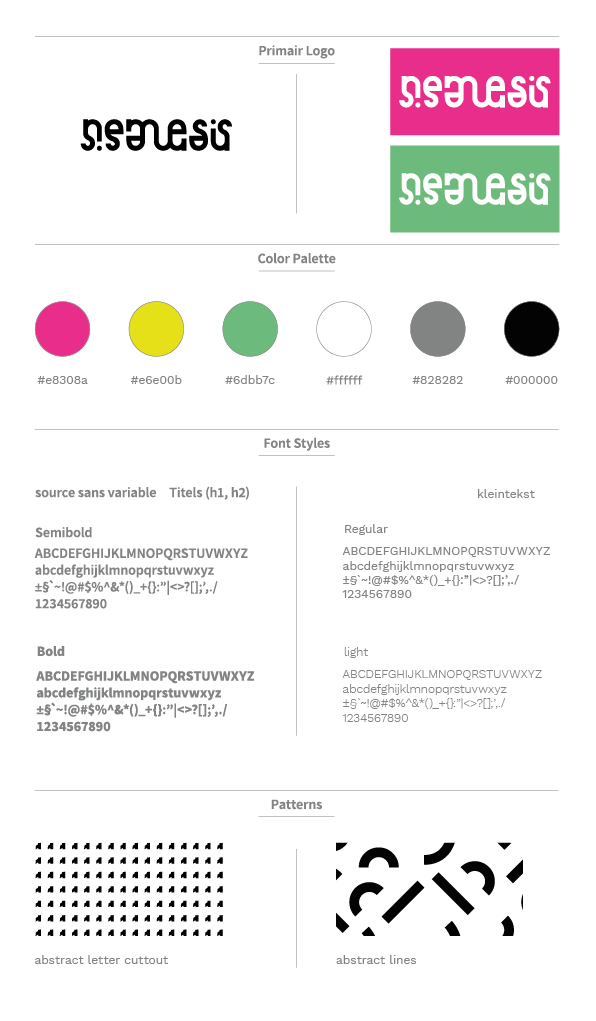
Ontwerpelementen
Het logo is minimalistisch maar memorabel. De ondersteunende grafische elementen creëren een herkenbare visuele taal die consistent is over alle touchpoints.
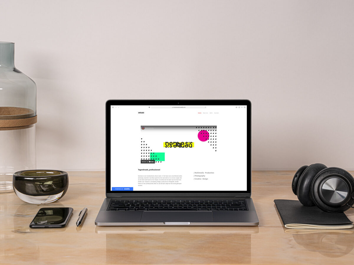
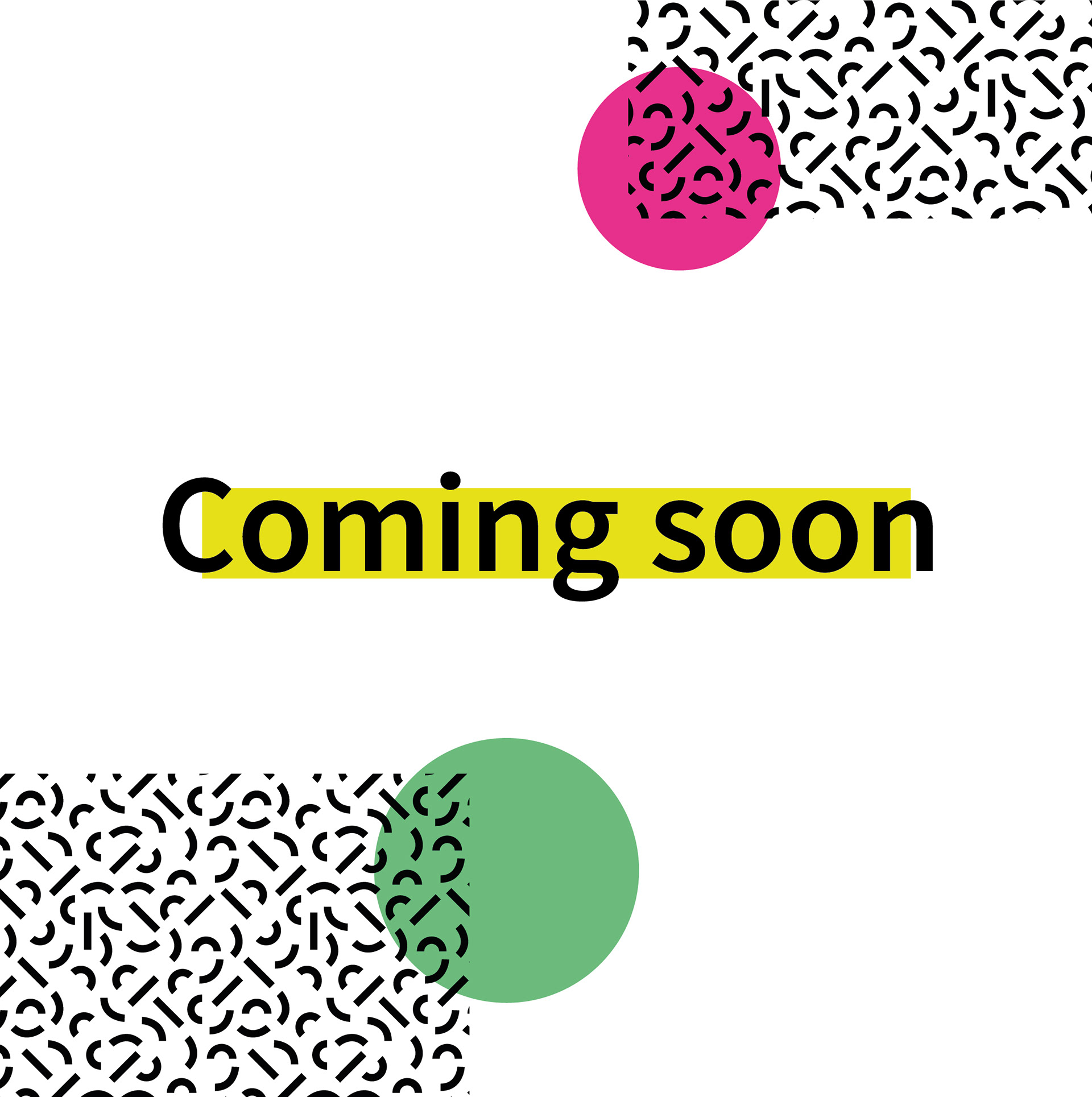
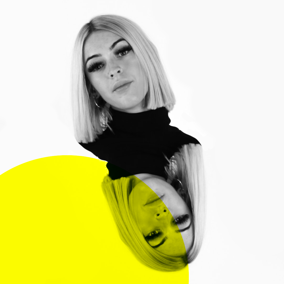
Projectbeelden
Interesse in een samenwerking?
Neem gerust contact op om de mogelijkheden te bespreken.
Neem Contact Op